
Irena Vilić is an information technologies student at University of Mostar and also our youngest colleague. She loves art and likes to manifest creativity in any possible way. She likes to learn new things and knows a lot about math and social media.
Well, probably the worst thing that can happen to a website (or a website owner) is a high bounce rate. Bounce rate is a percentage telling you how many visitors bounce off your website after visiting only one landing page. This shouldn't be the case. The lower the bounce rate, the better.
You need a good looking website if you want to keep your potential buyers and others on your website since the first impression is the most important one. So how to accomplish that?
We can all agree about one thing, and that is the famous latin quote -
" De gustibus non est disputandum (Tastes shouldn't be discussed). "
Some people prefer more clean, simple and minimalist website designs and on the other hand some people like illustrative, colorful website designs. But one thing, again, that we can all agree on that there is always a middle in everything.
So this article is about the most eye catching and important elements and principles you can use on your website, explained in 5 tips and tricks. All you need is a little commitment to some basic principles.
1. Free of clutter homepage
Again – first impression is the most important. If your homepage has a lot of text that probably leads to people leaving your site since they don't want to be occupied with a lot of words or sentences. The site should be simple, user-friendly, clean and clear. Think of your website as a house or an apartment. We all want to spend our time in a clean, minimalist and comfy space.
We rarely read every word on a website. Instead, people quickly scan pages picking just some keywords and sentences. The information should be served to people, without so much thinking – be clear and go straight to the point. Of course, text and calls to action are necessary but make sure to break them up with larger subheadings and legible paragraphs. Images or icons are for sure recomended as alternative way to show your thoughts.
In terms of SEO, a certain amount of text can be important. But the point here is to find a way to arrange the text paragraphs in a more good-looking way and to choose the best position on the landing page to insert the text. The best position for a large amount of text is typically in the bottom area on the landing page. And you should use all kinds of tricks to make the text look appealing. An example could be headings and catchy phrases, boxes and bullet points.

Example of a minimalist website - https://www.hvidbjerg.dk/
Have a place for everything!
Let’s get back to the house example. In a house, you are more comfortable, if everything is arranged after order – clothes in the locker, dishes in the sink or food in the fridge – make a schedule of your site and have a place for everything!
Minimalism
If you want your site to look modern and in trend you should check minimalist website designs. Minimalism has been among the top web design trends this year.
Despite the fact that minimalist sites are faster to develop, load faster and give a professional and clean impression, it is not quite easy to create one.
The important thing is to make it attractive, keep it clean, maintain a balance between fulfilling all requirements of the website and make it unique.

Example of a minimalist website - http://leenheyne.nl/
2. White space
What is it and why should you use it?
Many times it is referred as the amount of room between elements in your page. Adjust your page to older generations too! They may not be as computer literate as the younger generation so they will love the white space.
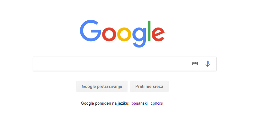
An example of great usage of whitespace that we are familiar with is Google. Their hompage is filled with whitespace and making it simple - we can focus on what is important: search.
Always think about every detail of a page – margins, header, footer, images, captions etc. – that will also be useful while including the whitespace in your designs. Make sure that you are leaving enough space between these elements, keep in mind that you want to create something elegant and clear while improving user experience.
Let your reader’s eyes relax! What would you like to see in a page? Think about it and you will figure out how to use the whitespace. Would you like to read a squeezed text in the page or something that is nice to see?
White space can help you deliver the experience that your client’s readers will enjoy, which leaves your client happy (which is our goal).
3. Fonts
You might not choose your family – but you do choose the type of font family you use. Serifs are those little projecting points or lines that some fonts have on the ends of their letters – Times New Roman is from the Serif fonts family. Sans Serif literally means „without serif“. These fonts are typically the best choice for online texts.
Also, there is such a thing as too many fonts. As a rule, don't use more than three different typefaces throughout a single website. Some projects may call for more elaborate font combinations, but if you do choose to use a variety of fonts, the effect should be harmonious, not cluttered.
About the size, you can’t read what you can't see. Early websites had small fonts, but, over time, people realized that 12pt fonts are hard to read online.
When a screen is 24 inches from someone's face, most people will struggle to see smaller fonts. A typical rule of thumb you'll see on the web is to keep your body text at least 16pt.
That's a good place to start, but keep in mind that this number depends on which font you're using.
Side note: Please consider your visitors eyes – give them a break. Sometimes the fancy (example - handwriting) fonts are not always the best choice.
Did you hear about dynamic web fonts? They are awesome because they allow designers to build webpages without having a limit of typical font family. Also, the best provider of fonts is Google Webfonts (you can access the app if you don't have Google Account) – the full setup process takes only 3 steps.
If you have no idea what font to use and need some inspiration – here are some free fonts that you can try out!

4. Transitions
What Steve Jobs said about design:
" It's not just what it looks like and feels like. Design is how it works. "
There are some websites that outperform other in design, content, features and so on. Details of interaction design and animation make a huge difference on modern websites. There are so many things that can be made and all you need is a little bit of creativity.
Lets start with the few examples:
- disorganized animation based on SVG
- depth of focus effect
- animation of page coordinate positioning spy
- smooth and continuous shape change
- vertical and continuous mask display and hide
Let's see some examples here: https://www.awwwards.com/websites/transitions/
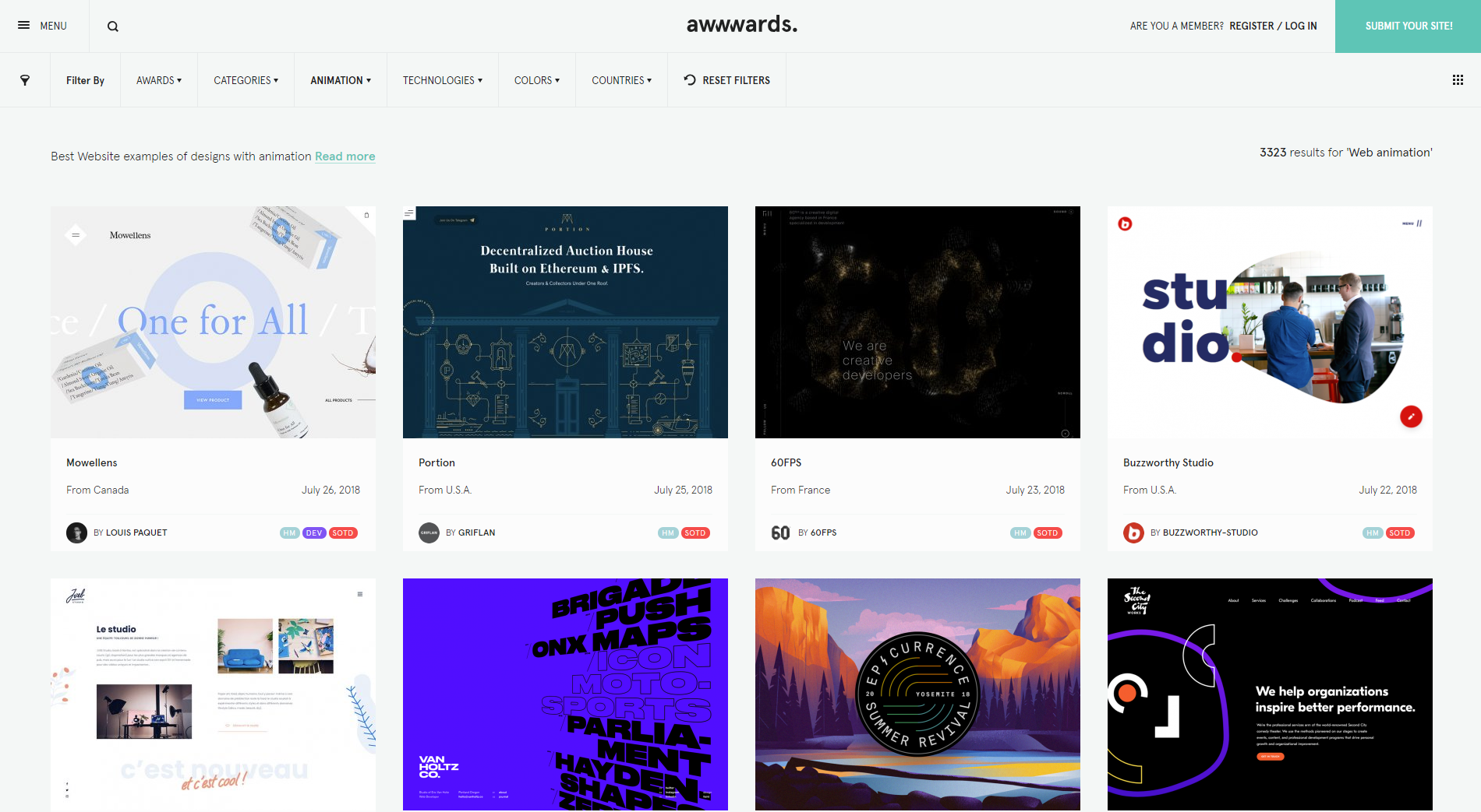
Selection of Awwwards winning animation websites or websites with a strong use of animation are shown on this site. We recommend to visit it if you need some inspiration for a great site designs! Pay attention to every detail!
For more cool examples visit these sites:
- https://www.designbetter.co/
- https://operationsamusreturns.com/en-gb - this is non-profit site made by fans with love and it uses one of the examples mentioned above (depth of focus effect)
- http://www.laborfit.com.br/academia-corporativa
5. Photos and animations
This is probably a job for your photographer or designer – but here is what you can do with this.
- Tell a story
For motion to have purpose and intent, it should do something. When it comes to your message or brand, that „something“ is to tell a story. Motion should tell a story that happens in an instant or moment, such as how to click a button or how to interact with your site. When it comes to your story, think about what users should take away – is it to perform an action based on the message or to remember who you are. Determine how to use motion – for the interface or for aesthetics.
Use images to illustrate concepts
Sometimes a picture really is worth a thousand words. While filler images serve no purpose in the world of usability, images that illustrate a concept are immensely valuable. If a photo can answer the users questions regarding the who, what, where, when or why of a product or service you're using the perfect photo.
If you are selling some products you need great pictures of them. Get in close and make your pictures not looking dimply. Also see where the light is coming from and use it to your advantage. The most important thing is how will you represent your product – background should be in one color (white recommended) and product should be the only thing focused. The same thing applies to animations.
- Use photos of real people
Studies show web designs that include people are more persuasive than those without. According to the studies, people will sign up just because you added a picture of a smiley, happy man in the landing page of one of your web apps.

We hope this article will give you more inspiration and improve design and development capabilities. Do you like it? Follow us on Facebook, LinkedIN or contact us.